Data handling
What this chapter covers
- Write statistical questions (questions whose answers vary) and choose a method to collect the data — interview, survey, observation or experiment (12.1.1)
- Classify data as categorical or numerical (discrete or continuous) and organise ungrouped data in a frequency table using tally marks (12.1.2)
- Construct a bar chart, dual bar chart, pie chart, line graph, dot plot and stem-and-leaf plot, and say why the representation suits the data (12.1.3)
- Convert one data representation to another suitable representation and justify the choice (12.1.4)
- Read and interpret bar charts, pie charts, line graphs, dot plots, stem-and-leaf plots, histograms and frequency polygons, and make inferences and predictions (12.1.5)
- Explain why data must be represented ethically, and spot misleading scales and inaccurate charts (12.1.6)
Malaysia's population in 2014 was about 30.6 million: 15.8 million males and 14.8 million females. Numbers like these are data. Data handling means collecting data, organising it, showing it in a chart, and then reading the chart to find out what the data tells us. You meet it in newspapers, on television, in sport and in almost every job.
| English | Bahasa Melayu |
|---|---|
| statistical question | soalan statistik |
| categorical data, numerical data | data kategori, data numerik |
| frequency table | jadual kekerapan |
| bar chart, pie chart, line graph | carta palang, carta pai, graf garis |
| dot plot, stem-and-leaf plot | plot titik, plot batang-dan-daun |
| histogram, frequency polygon | histogram, poligon kekerapan |
| interpreting data | mentafsir data |
12.1Data collection, organisation and representation process, and interpretation of data representation
Statistical questions and collecting data
| Question | Statistical? | Why |
|---|---|---|
| "How tall are the students in Class 1 Amanah?" | Yes | The heights vary: 150 cm, 156 cm, 164 cm, … |
| "What is the favourite food of the students in Class 1 Amanah?" | Yes | The answers vary: nasi lemak, fried noodles, laksa, … |
| "How tall is Rosmee?" | No | It has only one answer (one person, one height). |
After writing the question, choose how to collect the data (textbook p. 266).
| Method | Example |
|---|---|
| Interview | Ask students one by one how they travel to school. |
| Survey (questionnaire) | Give a form asking for each student's favourite TV programme. |
| Observation | Count the cars that pass a junction every hour. |
| Experiment | Record the temperature of hot water every five minutes as it cools. |
Show answerHide answer
b) No — there is only one answer.
c) Observation (watch and count).
Classifying data and frequency tables
Numerical data is a quantity measured with numbers. It can be discrete (counted in whole units: number of family members) or continuous (measured on a scale: mass 53 kg, 56.2 kg, 66.5 kg).
Example 1 (textbook p. 267)
- The body temperature of each student: numerical (continuous — it is measured).
- The number of trees planted in each district: numerical (discrete — it is counted).
- The causes of road accidents: categorical.
Ungrouped data is raw data that has not been organised. We organise it in a frequency table, using tally marks in groups of five.
Example 2 (textbook p. 267)
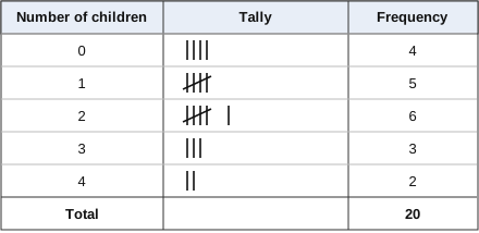
The number of children in each of 20 families: 2, 0, 1, 1, 2, 1, 3, 0, 4, 3, 2, 4, 1, 0, 2, 1, 0, 2, 2, 3.
- List the possible values 0, 1, 2, 3, 4 in the first column.
- Go through the data once, making a tally mark for each value. The fifth mark crosses the first four.
- Count the tallies to get each frequency, and check that the total is 20.
Show answerHide answer
The sizes are categorical data.
Constructing data representations
A chart makes data easier to read. The best chart depends on the type of data and the purpose. Every chart needs a title, labelled axes (or labelled sectors) and a uniform scale.
| Representation | Best for |
|---|---|
| Bar chart | Comparing categories (dual bar chart: comparing two sets of data) |
| Pie chart | Showing each category as a part of the whole |
| Line graph | Showing changes over a period of time (trends) |
| Dot plot | Showing the distribution of a small set of numerical data; spotting clusters and extreme values |
| Stem-and-leaf plot | Showing the distribution of numerical data while keeping every original value |
(a) Bar chart. Bars of equal width, evenly spaced; the height of each bar is the frequency.
Example 3 (textbook p. 269)
Leisure activities of Form 1 Bakti: Reading 8, Watching television 9, Surfing the Internet 7, Exercising 6, Listening to music 4.
- Draw the axes. Mark the vertical axis "Number of students" with a uniform scale from 0 (here 0 to 10).
- Label the horizontal axis "Activity" and draw one bar for each activity.
- Write the title.
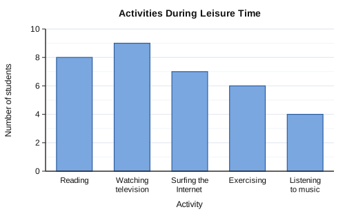
Justification: a bar chart is suitable for comparing the number of students in the different activities.
Example 4: dual bar chart (textbook p. 270)
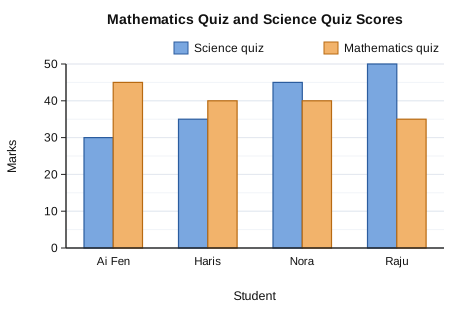
A dual bar chart puts two bars side by side for each student, with a key, so we can compare the two quizzes. For example, Ai Fen did better in Mathematics (45) than in Science (30).
(b) Pie chart. Sectors of a circle show each category as a part of the whole.
Example 5 (textbook pp. 270–271)
Cars sold by colour: Red 9, Yellow 12, White 10, Blue 5. Total = 9 + 12 + 10 + 5 = 36.
| Colour | Number of cars | Angle of sector |
|---|---|---|
| Red | 9 | 936 × 360° = 90° |
| Yellow | 12 | 1236 × 360° = 120° |
| White | 10 | 1036 × 360° = 100° |
| Blue | 5 | 536 × 360° = 50° |
| Total | 36 | 360° |
Draw a circle, draw a radius, measure each angle with a protractor, label the sectors and write the title.
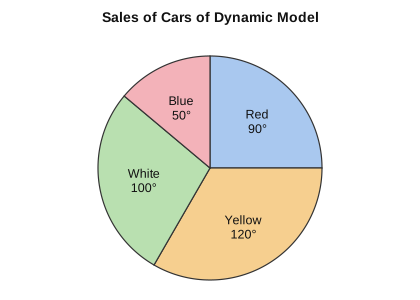
Justification: a pie chart is suitable for comparing each colour with the total number of cars.
Show answerHide answer
Rasa Sayang 30 × 3° = 90°; Ikan Kekek 120°; Bangau Oh Bangau 60°; Geylang Si Paku Geylang 45°; Lompat Si Katak Lompat 30°; Dayung Sampan 15°.
Check: 90 + 120 + 60 + 45 + 30 + 15 = 360°.
(c) Line graph. Points joined by straight lines show how data changes over time. Time goes on the horizontal axis.
Example 6 (textbook pp. 271–272)
A patient's temperature from 1 a.m. to 10 a.m.: 37.8, 37.9, 38.2, 38.4, 38.2, 37.9, 37.9, 37.6, 37.6, 37.5 (°C).
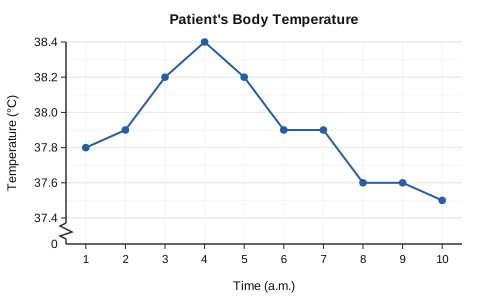
The scale goes up in 0.2 °C steps. The zigzag on the vertical axis shows that the values from 0 to 37.4 are left out. The graph shows clearly that the temperature was highest (38.4 °C) at 4 a.m. and then fell.
Justification: a line graph is suitable for showing the changes in temperature over 10 hours.
(d) Dot plot. Each value is a dot above a number line. It shows where the data clusters, how it spreads, and any extreme value (an unusual value far from the rest).
Example 7 (textbook pp. 272–273)
The duration of dental treatment, in minutes, for 14 patients: 23, 24, 21, 24, 25, 24, 25, 24, 22, 17, 21, 23, 22, 23.
- Draw a number line covering the smallest value (17) to the largest (25).
- Put one dot above the value for each patient; stack repeated values.
- Write the title.
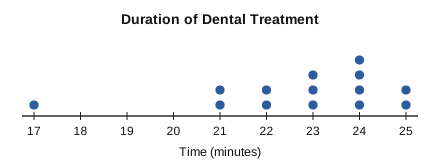
The times range from 17 to 25 minutes and cluster around 21 to 25 minutes. 17 minutes is an extreme value.
Show answerHide answer
Smallest 3, largest 11, so the number line runs from 3 to 11.
(e) Stem-and-leaf plot. Each value is split by place value: the leaf is the last digit and the stem is the digit or digits in front. Every original value is kept, so we can still calculate with the data.
Example 8 (textbook pp. 273–274)
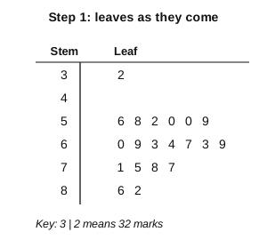
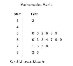
Mathematics marks of 20 students: 60, 56, 69, 32, 63, 58, 71, 86, 52, 64, 50, 67, 82, 63, 75, 50, 69, 78, 77, 59.
- Write the stems (tens digits) from 3 to 8 down the left, including 4 even though no mark is in the 40s.
- Write each units digit as a leaf beside its stem, in the order the data comes.
- Rearrange the leaves in ascending order. Repeated marks repeat their leaf (50 and 50 give 0 0).
- Write the key and the title.
Show answerHide answer
3 | 0 1 1 2 3 4 6 8 9
4 | 2 4 4 7 7
5 | 1 1 3 7 8 8
6 | 0 5
Key: 2 | 2 means 22 years. (Check: 2 + 9 + 5 + 6 + 2 = 24 leaves.)
Converting one representation to another
A representation can be changed into another one that suits the purpose better. Always justify the change.
Example 9: bar chart to line graph (idea from textbook pp. 275–276)
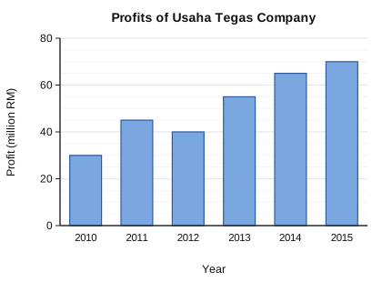
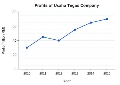
The data is collected over six years, so a line graph is more suitable: it shows the profit trend over time (here rising from RM30 million to RM70 million, with a small drop in 2012).
| From | To | Justification |
|---|---|---|
| Bar chart of data over time | Line graph | Shows changes over a period of time |
| Stem-and-leaf plot | Dot plot | Both show the distribution of numerical data and keep the original values |
| Pie chart (percentages) | Bar chart | Shows and compares the actual number in each category |
Show answerHide answer
Check: 7 + 5 + 9 + 4 = 25.
Interpreting data representations
To interpret a chart: read the values carefully from the scale, calculate (total, difference, mean, percentage), then make an inference (a conclusion about the data) or a prediction (what will probably happen next).
Example 10: line graph (textbook pp. 277–278)
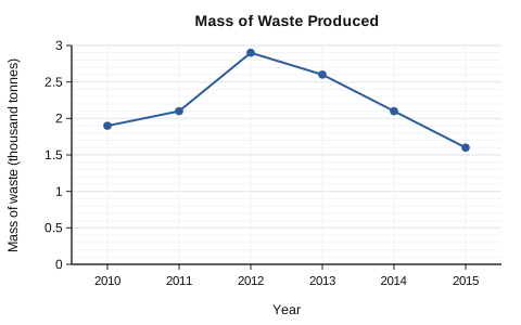
- Mass in 2010 = 1.9 thousand tonnes = 1 900 tonnes.
- 2011 and 2014 both show 2.1 thousand tonnes: the masses are the same.
- Total = 1 900 + 2 100 + 2 900 + 2 600 + 2 100 + 1 600 = 13 200 tonnes; mean = 13 2006 = 2 200 tonnes.
- Inference: the mass of waste decreases each year after 2012.
- Prediction: the trend continues downwards, so 2016 is about 1 100 tonnes (the textbook's answer).
Example 11: dot plot (based on textbook p. 278; numbers adapted)
The lifespans of 24 dry cells are tested. Cells lasting less than 10 hours are rejected.
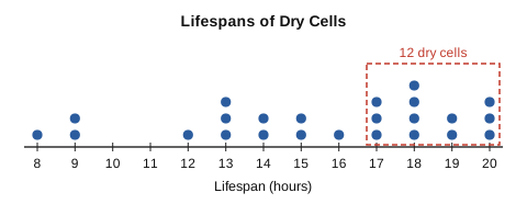
- Maximum lifespan = 20 hours; minimum = 8 hours.
- Rejected (less than 10 hours): the dots at 8 and 9 = 1 + 2 = 3 cells. Percentage = 324 × 100% = 12.5%.
- 50% of 24 = 12 cells. Counting from the right: 3 + 2 + 4 + 3 = 12 dots from 17 to 20, so 50% of the cells last at least 17 hours.
Histograms show grouped data (data in class intervals). The bars touch; each bar's width is an interval and its height is the frequency. A histogram does not show the actual values, but it can show a large data set.
Example 12: histogram (textbook p. 279)
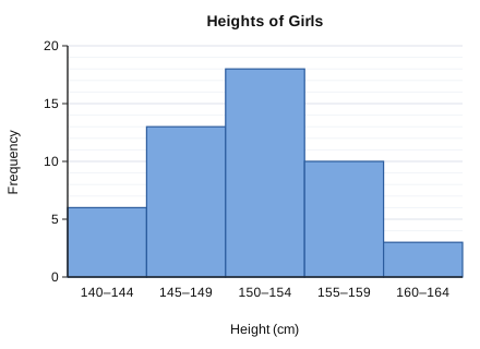
- Girls with heights 155–159 cm: 10.
- Girls 160 cm and above (eligible for volleyball): only the 160–164 bar, 3 girls.
- Inference: most girls are 145 cm to 159 cm tall. (Check: 6 + 13 + 18 + 10 + 3 = 50 girls.)
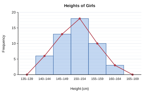
Example 13: frequency polygon (textbook p. 280)
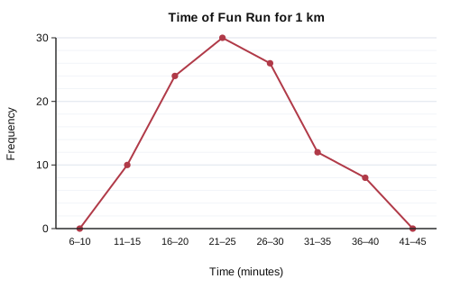
- Total participants = 10 + 24 + 30 + 26 + 12 + 8 = 110 (the end points at 0 add nothing).
- 16–20 minutes: 24 participants.
- Inference: most participants took 16 to 30 minutes.
Show answerHide answer
b) Exceeding 27.5 mm: 27.7, 27.8, 27.8, 28.2, 28.3, 28.6 = 6 axles (27.5 itself does not exceed 27.5).
630 × 100% = 20%
Representing data ethically
Example 14: a misleading scale (textbook p. 282)
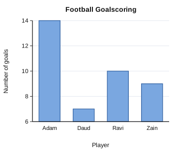
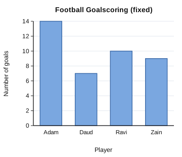
- Adam scored 14 goals and Ravi 10. Twice Ravi's goals = 20, so Adam did not score twice as many.
- On the first chart Adam's bar (14 − 6 = 8 units) looks twice Ravi's (10 − 6 = 4 units) because the axis starts at 6. This is misleading. The vertical scale should start at 0, as on the second chart.
Example 15: inaccurate data (textbook p. 282)
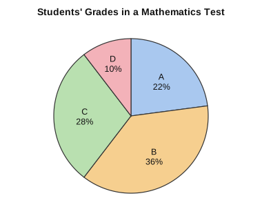
Total = 22 + 36 + 28 + 10 = 96%. The pie chart is not accurate because the percentages must add up to 100%.
Show answerHide answer
The manager might use graph P, where the line looks flatter. The data is the same, so the choice of scale can mislead the reader.
Summary
| Idea | Key fact | Example |
|---|---|---|
| Statistical question | Answered by collecting data that varies | "How tall are the students in 1 Amanah?" |
| Collecting data | Interview, survey, observation, experiment | Counting cars at a junction: observation |
| Categorical data | A characteristic, not measured | Blood group, colour of cars |
| Numerical data | Discrete (counted) or continuous (measured) | Number of siblings; mass 56.2 kg |
| Frequency table | Tally in fives, then count; check the total | Children in 20 families: 4, 5, 6, 3, 2 |
| Bar chart | Compare categories; equal widths, equal gaps | Leisure activities |
| Pie chart | Part of the whole; angle = frequency ÷ total × 360° | 9 of 36 cars → 90° |
| Line graph | Changes over time; trend and prediction | Temperature every hour |
| Dot plot | Distribution, clusters, extreme values | Dental treatment times |
| Stem-and-leaf plot | Keeps every value; leaves sorted; needs a key | 3 | 2 means 32 |
| Histogram, frequency polygon | Grouped data; polygon joins midpoints of bar tops | Heights 140–144, 145–149, … |
| Ethical representation | Scale starts at 0 and is uniform; data accurate | Pie chart percentages total 100% |