Mathematics questions, chapter 12
Nama / NameKelas / ClassTarikh / Date
Data handling
40 marks. Use Practice to check each answer as you go, or Exam to answer everything first. You may use a calculator. Show your working for Section B.
Section A: objective questions
12 marksChoose the correct answer.
1
Question 1
Which of the following is a statistical question?
Show answerHide answer
C
A statistical question is answered by collecting data that varies. The hours spent on homework are different for different students. The other questions each have only one answer.
2
Question 2
Which of the following is categorical data?
Show answerHide answer
A
Blood group (A, B, O, AB) is a characteristic that cannot be measured with numbers. Mass, number of siblings and time are all measured or counted, so they are numerical.
3
Question 3
Which of the following is continuous numerical data?
Show answerHide answer
D
Time is measured on a continuous scale (for example 13.4 s). Goals and books are counted in whole units, so they are discrete. Colours are categorical.
4
Question 4
The data shows the number of goals scored by a football team in 15 matches.
2, 0, 1, 3, 1, 2, 2, 4, 1, 0, 2, 3, 2, 1, 2
In a frequency table, what is the frequency of 2 goals?
2, 0, 1, 3, 1, 2, 2, 4, 1, 0, 2, 3, 2, 1, 2
In a frequency table, what is the frequency of 2 goals?
Show answerHide answer
B
Tally every 2 in the list: there are 6 of them. 4 is the frequency of 1 goal, and 15 is the total number of matches.
5
Question 5
In a survey of 40 students, 12 students chose badminton as their favourite sport. Find the angle of the sector for badminton in a pie chart.
Show answerHide answer
A
Angle = 12/40 × 360° = 108°. 30 is the percentage (30%), not the angle, and 12° uses the frequency as the angle.
6
Question 6
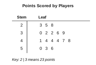
Diagram 1 shows the points scored by 17 basketball players. Find the difference between the highest and the lowest points.
Show answerHide answer
C
Highest = 56, lowest = 23, so the difference is 56 − 23 = 33. 30 compares only the stems (50 − 20), and 3 compares only the leaves (6 − 3).
7
Question 7
Puan Aini records the temperature in her classroom every hour from 8 a.m. to 2 p.m. Which representation is the most suitable to show how the temperature changes?
Show answerHide answer
B
A line graph shows changes in data over a period of time. A pie chart shows parts of a whole, which makes no sense for temperatures.
8
Question 8
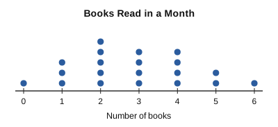
Diagram 2 is a dot plot of the number of books read in a month by 20 students. What percentage of the students read at least 4 books?
Show answerHide answer
D
At least 4 means 4, 5 or 6 books: 4 + 2 + 1 = 7 students. 7/20 × 100% = 35%. 20% counts only the students who read exactly 4 books, and 7% forgets to divide by 20.
9
Question 9
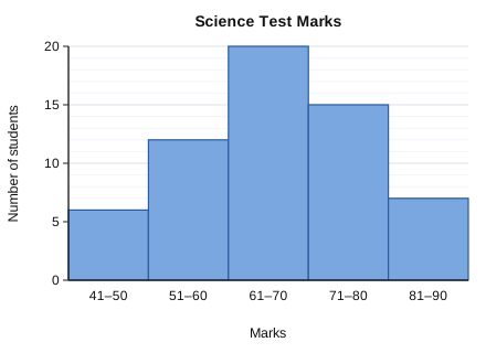
Diagram 3 shows the Science test marks of 60 students. How many students scored more than 70 marks?
Show answerHide answer
A
More than 70 marks means the classes 71–80 and 81–90: 15 + 7 = 22. 15 uses only one class, and 42 wrongly includes 61–70.
10
Question 10
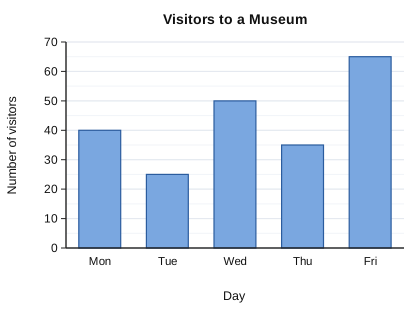
Diagram 4 shows the number of visitors to a museum from Monday to Friday. How many more visitors came on Friday than on Tuesday?
Show answerHide answer
C
Friday = 65 and Tuesday = 25, so 65 − 25 = 40 more visitors. 90 adds the two days instead of subtracting.
11
Question 11
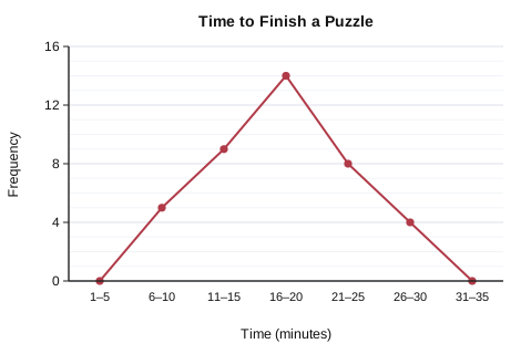
Diagram 5 is a frequency polygon of the time taken by a group of pupils to finish a puzzle. How many pupils took 16 minutes or more?
Show answerHide answer
D
16 minutes or more means the classes 16–20, 21–25 and 26–30: 14 + 8 + 4 = 26. 14 uses only the 16–20 class, 12 starts from 21 minutes, and 40 is all the pupils.
12
Question 12
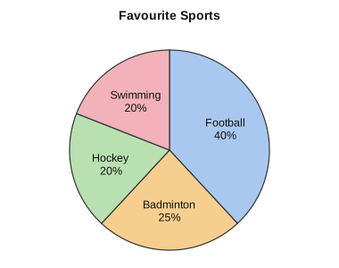
Diagram 6 shows a pie chart drawn by Kamal for the favourite sports of his classmates. Which statement best evaluates his pie chart?
Show answerHide answer
B
40 + 25 + 20 + 20 = 105%. The parts of a whole must add up to 100%, so the data shown is not accurate. Pie charts can show percentages.
Section B: structured questions
28 marksAnswer all questions. Show your working.
13
Question 13
Siti collects four kinds of data about her classmates: (i) favourite colour, (ii) length of their hand span, (iii) mode of transport to school, (iv) number of siblings.
[2 marks]
(a)Classify each kind of data as categorical or numerical.
Show answerHide answer
Tick each point you got.
[1 mark]
(b)The number of siblings is
Show answerHide answer
discrete data
Siblings are counted in whole numbers (0, 1, 2, …), so the data is discrete.
14
Question 14
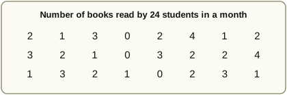
Diagram 7 shows the number of books read by 24 students in a month.
[2 marks]
(a)Construct a frequency table, with tally marks, for the data.
Show answerHide answer
Tick each point you got.
[1 mark]
(b)How many students read more than 2 books?
Show answerHide answer
Tick each point you got.
15
Question 15
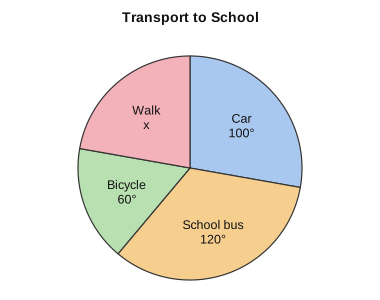
Diagram 8 is a pie chart showing how 72 students travel to school.
[2 marks]
(a)Find the value of x.
Show answerHide answer
Tick each point you got.
[2 marks]
(b)Find the number of students who travel by school bus.
Show answerHide answer
Tick each point you got.
16
Question 16
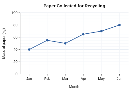
Diagram 9 shows the mass of paper collected for recycling by a school from January to June.
[1 mark]
(a)In which month did the mass of paper collected decrease compared with the month before?
Show answerHide answer
Tick each point you got.
[2 marks]
(b)Find the mean mass of paper collected per month over the six months.
Show answerHide answer
Tick each point you got.
[1 mark]
(c)Based on the trend of the graph, predict the mass of paper collected in July.
Show answerHide answer
Tick each point you got.
17
Question 17
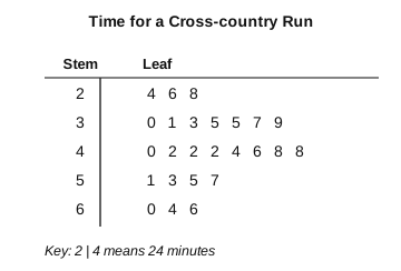
Diagram 10 shows the time taken by 25 students to complete a cross-country run.
[1 mark]
(a)State the shortest time and the longest time.
Show answerHide answer
Tick each point you got.
[2 marks]
(b)Students who finish in less than 35 minutes receive a medal. Find the percentage of students who receive a medal.
Show answerHide answer
Tick each point you got.
[1 mark]
(c)State one inference based on the stem-and-leaf plot.
Show answerHide answer
Tick each point you got.
18
Question 18
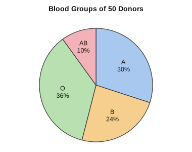
Diagram 11 shows the blood groups of 50 blood donors.
[2 marks]
(a)Find the number of donors in each blood group.
Show answerHide answer
Tick each point you got.
[1 mark]
(b)The pie chart is to be converted to another representation that shows the actual number of donors in each group. Name a suitable representation and justify your choice.
Show answerHide answer
Tick each point you got.
19
Question 19
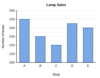
Diagram 12 shows the number of lamps sold by five shops in a month. Shop E claims, "We sold twice as many lamps as Shop C, look at the bars!"
[1 mark]
(a)State the number of lamps sold by Shop C and by Shop E.
Show answerHide answer
Tick each point you got.
[2 marks]
(b)Is Shop E's claim valid? Show your working.
Show answerHide answer
Tick each point you got.
[1 mark]
(c)Explain why the bar chart makes the claim look true, and how it should be drawn.
Show answerHide answer
Tick each point you got.
20
Question 20
Aina wants to find out how much time the Form 1 students in her school spend on the Internet each day. She plans to survey 30 students and record each time to the nearest minute.
[1 mark]
(a)Write a statistical question for Aina's study.
Show answerHide answer
Tick each point you got.
[1 mark]
(b)Suggest a suitable method to collect the data.
Show answerHide answer
Tick each point you got.
[1 mark]
(c)Choose a stem-and-leaf plot or a pie chart to represent her data. Justify your choice.
Show answerHide answer
Tick each point you got.