Measures of Dispersion for Grouped Data
What this chapter covers
- Construct a histogram and a frequency polygon for grouped data, and compare the shape and dispersion of two or more distributions (7.1)
- Construct an ogive for grouped data and use it to find quartiles and percentiles (7.1)
- Determine the range, interquartile range, variance and standard deviation for grouped data (7.2)
- Construct and interpret a box plot for grouped data (7.2)
- Compare two or more sets of grouped data using measures of dispersion and make a conclusion (7.2)
- Solve problems involving measures of dispersion for grouped data, and plan a statistical mini-project (7.2)
7.1Dispersion
Organising grouped data
| Term | How to find it | Class 150 – 154 |
|---|---|---|
| Lower limit, upper limit | Smallest and largest value written in the class | 150 and 154 |
| Midpoint | (lower limit + upper limit) ÷ 2 | 152 |
| Lower boundary | (upper limit of class before + lower limit of this class) ÷ 2 | 149.5 |
| Upper boundary | (upper limit of this class + lower limit of class after) ÷ 2 | 154.5 |
| Size of class interval | Largest − smallest value ÷ number of classes; or upper boundary − lower boundary | 154.5 − 149.5 = 5 |
The cumulative frequency of a class is its frequency added to the total of all the classes before it. It tells you how many values are at or below the upper boundary.
For 145 – 149: midpoint 147, boundaries 144.5 and 149.5.
Histogram and frequency polygon
- Histogram: bars touch each other. Bar width = class size, drawn from lower boundary to upper boundary. Bar height = frequency.
- Frequency polygon: mark the midpoint at the top of each bar and join them with straight lines. Add one class with frequency 0 before the first class and after the last class so the polygon touches the horizontal axis.
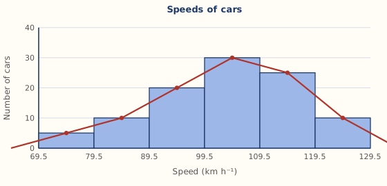
Redrawn from textbook Example 3, p. 201.
Show answerHide answer
Shape of a distribution
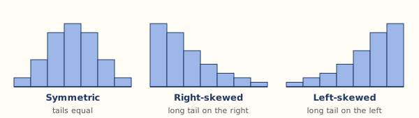
| Shape | What you see | Typical meaning |
|---|---|---|
| Symmetric (bell or uniform) | Left and right halves look alike | Values spread evenly about the middle |
| Skewed to the right | Peak on the left, long tail to the right | Most values are low, a few are very high |
| Skewed to the left | Peak on the right, long tail to the left | Most values are high, a few are very low |
To compare dispersion of two distributions, compare how far each is spread out on the horizontal axis (the wider spread has the greater dispersion). Then say which one performed better by looking at where most of the values lie. Always give a reason that refers to the graph.
Ogive, quartiles and percentiles
For N values the positions are: Q1 at N/4, median Q2 at N/2, Q3 at 3N/4, and the k-th percentile Pk at (k/100) × N. Go across from the position on the cumulative frequency axis to the curve, then down to read the value. P25 = Q1, P50 = Q2, P75 = Q3.
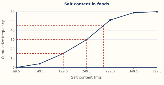
Redrawn from textbook Example 7, p. 207. Reading the curve gives Q1 = 199.5 mg, Q2 = 249.5 mg and Q3 ≈ 285 mg (the book reads 284.5 mg).
Show answerHide answer
7.2Measures of dispersion
Range and interquartile range
- Range = midpoint of the highest class − midpoint of the lowest class.
- Interquartile range = Q3 − Q1 (read from the ogive). It is the spread of the middle 50% of the values and is not affected by extreme values.
N = 80: Q1 at position 20, Q3 at position 60. From the ogive Q1 = 614.5 g and Q3 = 809.5 g, so IQR = 195 g.
Variance and standard deviation
| Marks | f | Midpoint x | fx | fx² |
|---|---|---|---|---|
| 10 – 19 | 6 | 14.5 | 87 | 1 261.5 |
| 20 – 29 | 10 | 24.5 | 245 | 6 002.5 |
| 30 – 39 | 3 | 34.5 | 103.5 | 3 570.75 |
| 40 – 49 | 1 | 44.5 | 44.5 | 1 980.25 |
| Total | 20 | 480 | 12 815 |
Show answerHide answer
Box plot
A box plot shows the five-number summary: minimum, Q1, median, Q3 and maximum. For grouped data, read Q1, Q2 and Q3 from the ogive, and take the minimum and maximum from the ogive axis ends.
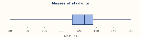
Redrawn from textbook Example 11, p. 214.
| Box plot looks like | Distribution |
|---|---|
| Median in the middle, whiskers about equal | Symmetric |
| Left side (box or whisker) longer | Skewed to the left |
| Right side (box or whisker) longer | Skewed to the right |
Comparing two sets of data
- Compare the mean first (which set is larger or better on average).
- Then compare the standard deviation: the smaller one means the data are more consistent (closer to the mean).
- Give a conclusion in words that fits the question, such as "larger and more consistent".
Hybrid A produces larger petals (greater mean) and they are more consistent (smaller σ).